

Men’s Bedroom Color Schemes That Actually Work
Short answer: the most reliable men’s bedroom color schemes pair one deep tone (charcoal, navy, forest green or espresso) with warm neutrals, then repeat a single wood tone and a single metal finish so the room reads deliberate. Keep the palette to two or three core colors plus one small accent, and balance dark surfaces with lighter bedding so the room still feels restful at night. Everything else — texture, art, lighting — is there to support that palette, not compete with it.
Key Takeaways
- Balance beats boldness: dark walls need lighter bedding (or the reverse) to avoid a cave.
- Use roughly a 70/20/10 split: dominant neutral, secondary deep tone, small accent.
- Pick one wood species and one metal finish, then repeat them across furniture, lamps and hardware.
- Texture — leather, wool, linen, matte paint — adds depth so you need fewer colors.
- Test paint samples on the actual wall at different times of day before committing.
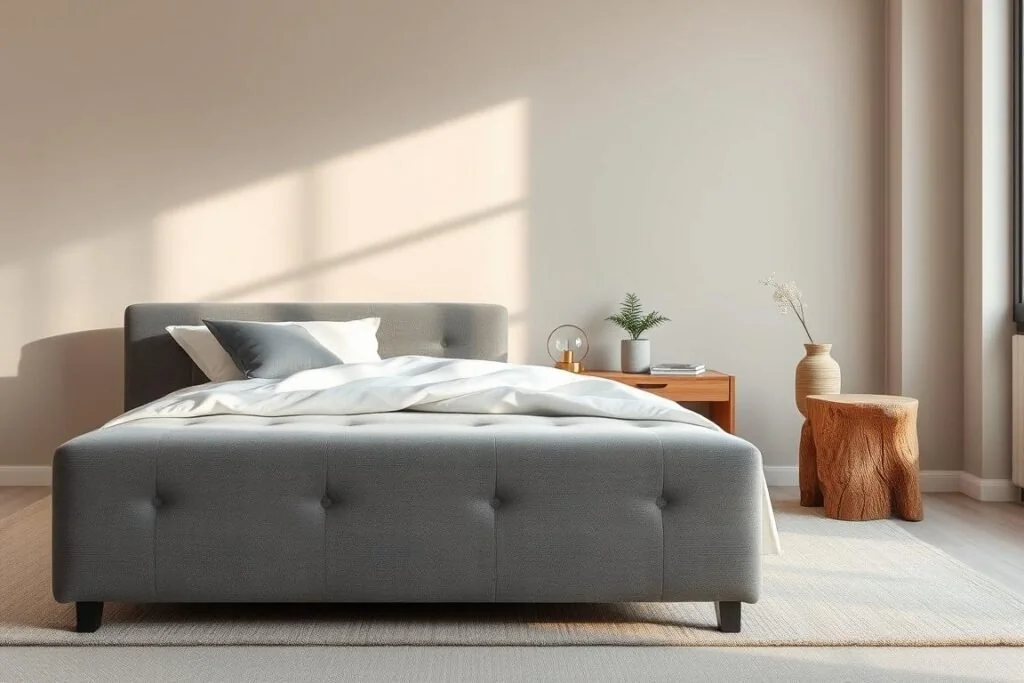
Charcoal, off-white and warm oak — strong without feeling heavy.
Start With the Structure, Not the Swatch
Decide one thing first: do you want a light and airy backdrop with dark furniture, or dark and cocooning walls with light textiles? Both look masculine; they just move the contrast to a different place.
- Light walls + charcoal bed + walnut nightstands = open but grounded. Best for small or low-light rooms.
- Dark walls + off-white duvet + pale wood shelves = moody but calm. Best for rooms with decent daylight or good layered lighting.
Then apply a simple ratio so the palette doesn’t drift: about 70% dominant tone (walls, large textiles), 20–30% secondary tone (bed frame, rug, curtains), and a small percentage of accent color (throw, art, one pillow). Repeat the accent at least three times — art, textile, lamp — so it looks chosen rather than left over.
Seven Palettes to Steal
| Scheme | Walls | Bedding | Wood / metal | Accent |
| Charcoal & oak | Charcoal (one wall or all four) | Light gray, off-white | Pale oak / brushed brass | Rust |
| Deep navy | Navy | Crisp white, taupe | Walnut / matte black | Cognac leather |
| Forest green | Muted forest green | Oatmeal linen | Oak / aged brass | Warm olive |
| Monochrome, softened | Off-white or heather gray | Charcoal and white | Black metal / ash | Black (hardware, lamp bases) |
| Gray & beige neutral | Soft gray | Beige, warm white | Walnut / nickel | Burnt orange |
| Earthy rustic | Sage or smoky blue | Charcoal, undyed linen | Reclaimed wood / iron | Jute and greenery |
| Light & bright | Crisp white | White with one accent | Light wood / black | Graphic rug pattern |
Dark and Moody Without Going All-Black
Full black walls are unforgiving: they swallow light and show every scuff. Charcoal, navy and forest green give you the same weight with more nuance. Soften them with lighter textiles, pale or mid-tone wood, and warm-toned metals so the room feels enveloping rather than cold.
- In a small room, keep the darkest tone to one wall or the bed frame, not every surface.
- Choose a matte or eggshell finish on large walls to hide imperfections; use a slightly higher sheen where hands and furniture make contact.
- Buy sample pots and paint a large patch — dark colors shift dramatically between morning daylight and lamplight.
- Ventilate while painting and for a while afterwards. The US EPA notes that indoor levels of several organic compounds average two to five times higher than outdoors, and spike during activities like painting and paint stripping.
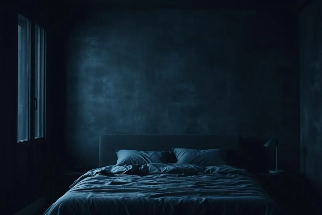
A charcoal feature wall plus light bedding stays moody but sleep-ready.
Softer Neutrals: Black and White, Evolved
Straight black-and-white can read like a showroom. Swap stark white for off-white, bone or heather gray and the scheme stays graphic but becomes far more livable. An upholstered headboard softens the hard lines and gives the wall a tactile focal point; repeating black in lamp bases, frames and drawer pulls ties it together. Limit yourself to two quiet patterns — say a subtle weave on the duvet and a geometric rug.
Neutral Foundations: Gray, Beige and Wood
Gray and beige are the easiest long-term bases because small changes feel intentional against them. The trick is warmth: unify your wood tones (oak with oak, walnut with walnut) rather than mixing four species, and let a single accent do the lifting — burnt orange, muted rust or sage in a throw, a print and one lamp.
Wood grain is a color decision as much as a material one. If you’re choosing a frame around the palette rather than the other way round, our guide to wood bed designs shows how different species and finishes read in a room, and a storage bed frame keeps the floor clear so the palette stays the main event.
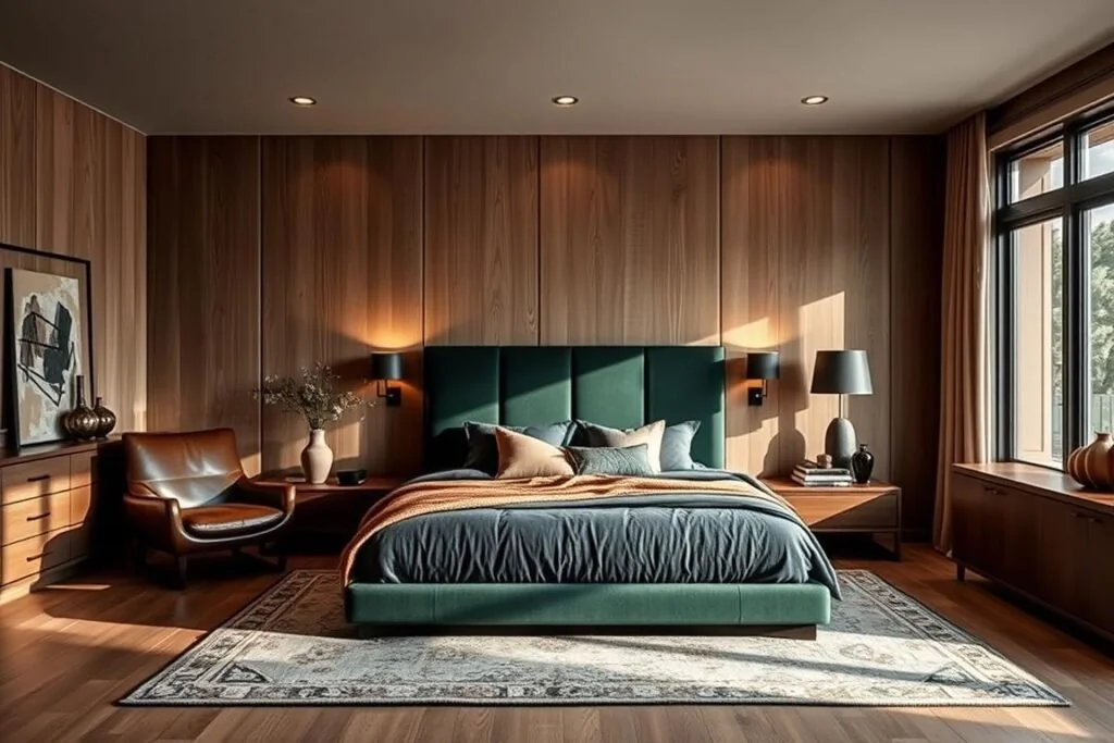
A gray base with walnut accents is modern and easy to update seasonally.
Warm Rustic and Earthy Materials
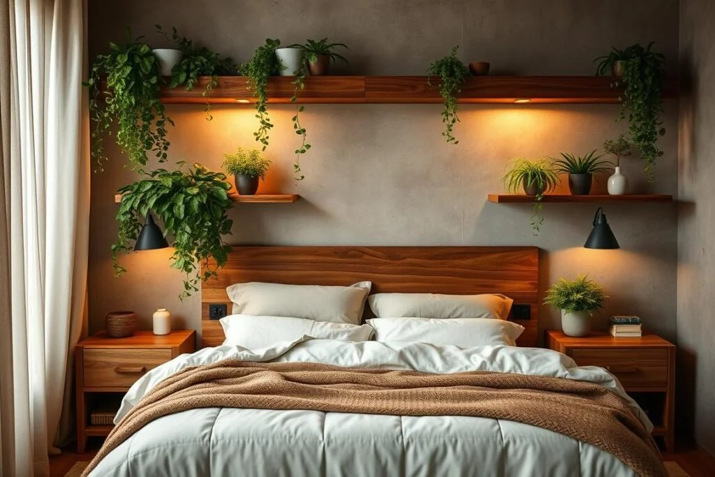
Leather, wool, reclaimed wood and stone carry a scheme on texture alone. Keep the shapes simple so grain and patina do the work, and let plants supply the only “bright” color in the room — hardy, low-light species like snake plant, ZZ or pothos survive neglect better than anything flowering.
- Sage or smoky blue walls with undyed linen and a jute rug feels natural without tipping into beach house.
- Introduce concrete in small doses — a tray, planter or side table — rather than a whole wall.
- Echo warm tones in a striped rug or a framed landscape so the accent appears at two heights.
Light and Bright but Still Masculine
If you’d rather not go dark, keep the walls crisp white and build contrast underfoot and overhead: a bold geometric rug, a black-framed mirror, one strong artwork. Keep bedding mostly white and let a single accent color appear in two or three places. Wall-mounted lights in place of table lamps free up nightstand surfaces and add symmetry, which is most of what makes a pale room look tailored rather than empty. If square footage is the real constraint, these tricks for making a small bedroom look bigger pair well with a light scheme, and getting the rug size right matters more than the rug’s pattern.
Lighting: The Part Most Palettes Get Wrong
Paint only looks as good as the light hitting it. Deep colors in particular need layers — ambient, task and accent — or they flatten out after dark.
- Use warm-white bulbs for evening light. Warm-white LEDs sit around 2700K, while cool- and daylight-white products run roughly 5000–6500K, according to the US Department of Energy.
- Put the overhead fixture on a dimmer; add bedside sconces or directed lamps for reading.
- Low-profile LED strips behind a headboard or under a platform frame graze the wall and reveal texture.
- Plug-in sconces and smart plugs give renters the same effect without wiring.
There’s a practical reason to favour warm, dim light at night: the NHLBI advises keeping the bedroom quiet, cool and dark, and reserving the hour before bed for quiet time away from bright light. And since the CDC puts the recommended amount of sleep for adults at seven hours or more, a scheme that fights your wind-down is working against you. For a fuller walkthrough, see our guide to cozy bedroom lighting.
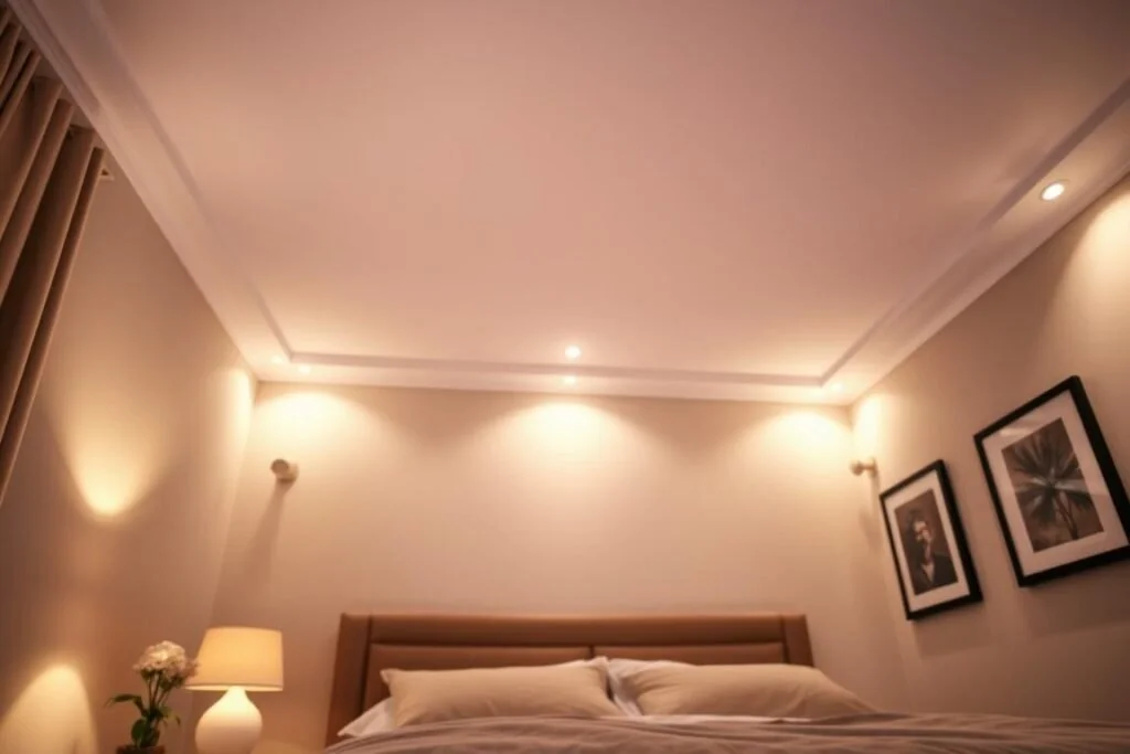
Art and Walls: Sizing Rules That Keep a Palette Tidy
One oversized piece reads calmer than a scatter of small frames, and it’s the fastest way to repeat your accent color at scale. Two widely used design conventions do most of the work:
- Width: aim for artwork (or a grouping) about 60–80% of the width of the furniture below it. Over a 60″ queen bed that’s roughly 36–48″ wide.
- Height: centre the piece around eye level — commonly cited as about 57″ from the floor — and leave roughly 6–10″ of breathing room above a headboard.
Keep frame tone consistent, favour matte or low-glare finishes so lamps don’t bounce off the glass, and repeat one color from the artwork in a pillow or throw. More layouts for the space above the bed are in our bedroom wall decor guide.

An Order of Operations (Cheapest Moves First)
- Free: declutter surfaces, pull furniture off the walls, clear window lines so daylight reaches the back of the room. This alone changes how any palette reads.
- Nearly free: swap harsh bulbs for warm dimmable ones; match sheets, duvet and shams so the bed looks like one object instead of three.
- Low cost: paint a single feature wall, or use removable textured wallpaper if you rent. Frame the two posters worth keeping and bin the rest.
- Bigger swings: a rug sized to the bed, a statement headboard on your existing frame, and secondhand solid-wood nightstands you can refinish and rehandle.
Prices vary too much by region and season for us to quote figures honestly — but the sequence holds regardless of budget.
Does Wall Color Actually Affect Sleep?
Be sceptical of confident claims here. Direct research linking a specific wall color to measurable sleep outcomes is thin, and the popular “best colors for sleep” lists mostly extrapolate from general color-psychology studies. What is well supported is the environment around the color: a dark, quiet, cool room and dim evening light. So choose the palette you actually like, then control glare, brightness and clutter — that’s where the measurable gains are.
FAQ
What are the best men’s bedroom paint colors for a small room?
Keep walls light — white, bone or pale gray — and move the depth to the bed frame, rug or bedding. A charcoal bed in a pale room feels grounded without shrinking the space.
How do I stop a dark palette feeling heavy?
Limit the deep color to one wall, add off-white bedding, keep one wood tone light, and light the room in layers with warm dimmable bulbs. Matte paint plus tactile textiles reads rich; glossy dark paint reads cold.
Which accent colors work with gray and beige?
Burnt orange, muted rust, cognac and sage add warmth without shouting. Use the accent in three spots — art, a throw, one lamp or planter.
How many colors should a men’s bedroom scheme use?
Two or three core hues plus one accent. Texture, not extra color, is what adds depth once you’ve hit three.
Do I need to match wood and metal finishes exactly?
Not exactly, but limit yourself to one dominant wood tone and one dominant metal. Brushed brass pairs naturally with walnut and warm neutrals; matte black and nickel suit navy and cool grays.
Where should I start if I can only do one thing?
Lighting. Warm, dimmable, layered light flatters every palette on this page — and it’s cheaper than repainting.
Related Reading
- Bedroom Furniture & Layout Guide: From Frames to Floor Plans
- How to Layer Rugs in a Bedroom for a Designer Look
Updated September 2026.